Shamefully Bad Game Boxart Of the Moment (#3)
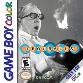
Capcom’s history in boxart design has been a double-edged sword. On one hand you have great-looking art like Viewtiful Joe and Mega Man X8. Then on the other hand you have horrendous looking trash like the original Mega Man on NES and this…
Trouballs. Like Viewtiful Joe, it contains a made-up word in its title. And unlike Viewtiful Joe, its box art is awful. Maybe someone at Capcom thought it looked funny, but from the little info I’ve hard on this game the gameplay is certainly not humorous or explosive (both things the box arts display). Take a look at the screens:
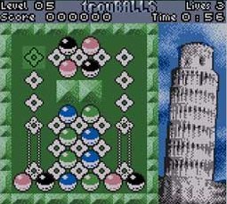
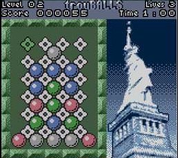
Looks like a forgettable, cookie-cutter puzzle game to me. And that’s what it probably is, since within a month of its release it became practically forgotten. I can’t say the box art helped it market-wise in the slightest bit.
posted by Ross @ 10:29 PM
5 comments
![]()

5 Comments:
Hehehe you said "trouballs"
He's said much worse...
Ross, why don't you add links at the end of the article, leading to parts 2 or 1 of the Bad Box Gameart?
Good idea Gnome.
However, I had another idea in store for the future. However, it will happen months down the line and yes, I'm regarding the Shamefully Bad Artwork posts. Well, you might see in the future...
And Wedge... You said "Trouballs" too!
If everybody keeps on saying trouballs I'll call an exorcist.
Post a Comment
<< Home